Just days before Apple’s “Awe-dropping” event, a major design mystery surrounding the iPhone 17 Pro and Pro Max appears to be solved. While we already know plenty about the new devices, the biggest question mark was their rear design. New reporting now points to the most dramatic visual overhaul in years.
The Competing Rumors
Until now, two competing theories have swirled around the iPhone 17 Pro’s back panel:
- The Evolutionary Approach: A continuation of the current all-glass design, but with an expanded, full-width camera bar across the top.
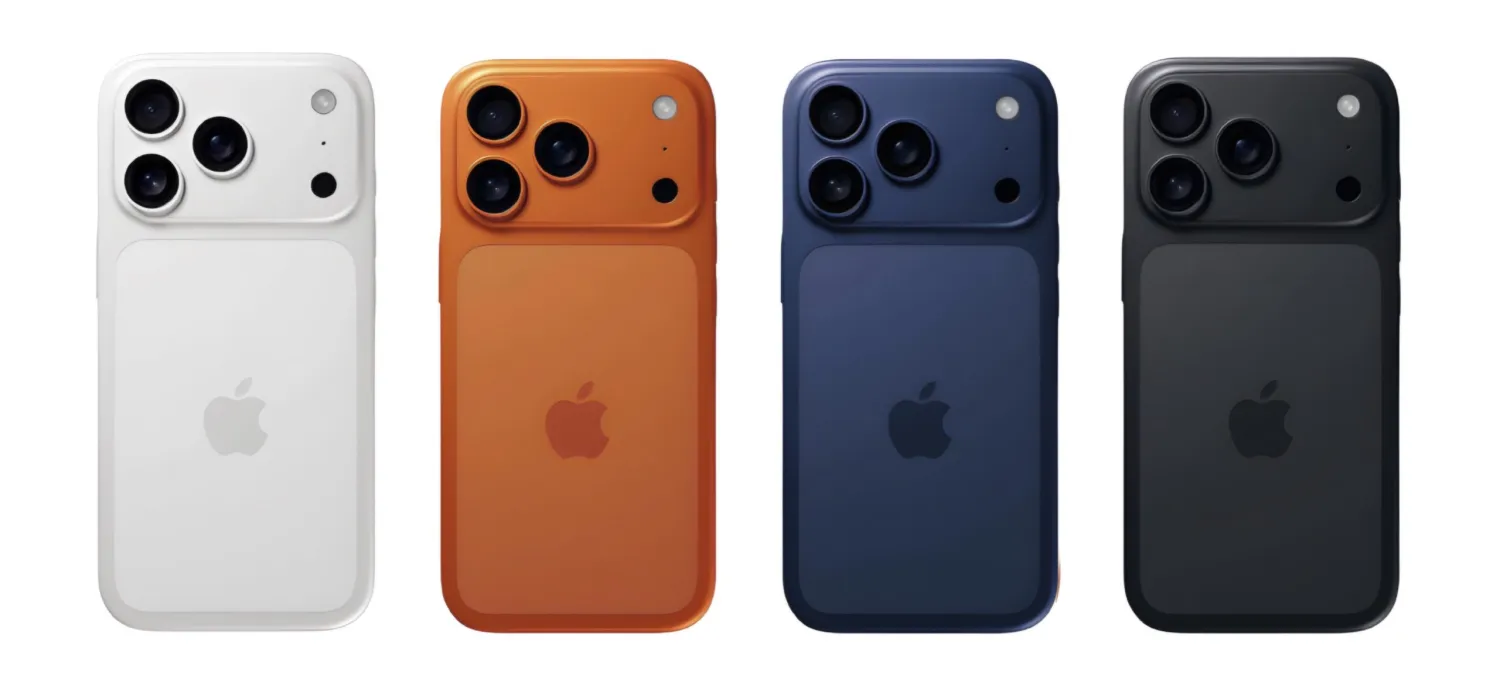
- The Radical Redesign: A striking two-tone design combining aluminum and glass, featuring a dedicated MagSafe section.
Initially, the two-tone design was dismissed by many as a schematic oddity. But a key authority has now weighed in, shifting the consensus entirely.
Gurman’s Verdict: The Radical Redesign is Real
Bloomberg’s Mark Gurman, a renowned Apple insider, has provided crucial details that align perfectly with the more radical leak. In his latest report, he states:
“The back of the phones look different, including a new camera area that spans the entire length of the top third of the device as well as a new cutout area on the bottom two-thirds of the phone that doubles as the wireless charging area.”
This description is a near-perfect match for the aluminum-and-glass design, effectively confirming a significant departure from the all-glass backs of previous Pro models.
Why This Design Change Matters
If accurate, this shift is more than just aesthetic; it has tangible benefits:
- A Fresh Identity: This would be the most noticeable design change to the iPhone Pro lineup in its history, giving it a distinct new look.
- Potential Weight Savings: Moving from a titanium and glass construction to aluminum and significantly less glass could substantially reduce the overall weight of the iPhone Pro and Pro Max—a welcome change for many users.
- A Glimpse into the Future: This move could be a strategic step toward the rumored all-glass “iPhone 20,” signaling Apple’s experimentation with new material combinations.
What’s your take? Do you welcome this bold, two-tone redesign, or would you prefer Apple stick with the current, more uniform look? Let us know in the comments.
In case you have found a mistake in the text, please send a message to the author by selecting the mistake and pressing Ctrl-Enter.
Sign In