CSS min() and max() are two versatile yet underutilized functions in responsive web design, and Divi 5 has full support for both since the Advanced Units update. While we’ve previously explored fluid typography with clamp() and dynamic calculations with calc(), min() and max() give you even simpler ways to achieve responsive design.
In this post, we’ll show you how to use these functions using Divi (Divi 5 is ready for you to use on new websites, with a recommendation for migration for existing sites coming soon). Anything you can do to use responsive functions will reduce your dependence on media queries, CSS is a beautiful thing!
CSS min() And max(): Smarter Layouts With Simpler Logic
If you’ve already explored clamp(), you’re halfway to mastering min() and max()! If you remember, clamp() uses three values simultaneously (min, preferred, and max), min and max in clamp() is the same concept but with only 1/3rd of the logic at a given time.
What Do min() And max() Do?
The min() and max() functions let you set two or more values, with the smallest (min) or the largest one (max) being displayed based on screen size.
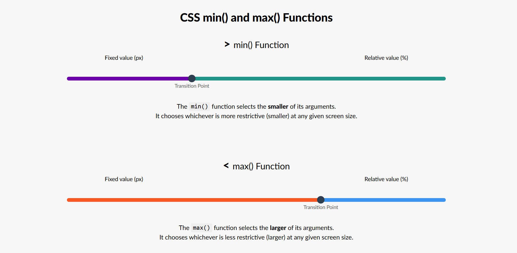
The “Transition Point” is determined respective to the two values you set, so this is only for visualization purposes
min(): Always Chooses The Smaller Value
Use min() to prevent wide screens from stretching content excessively. This is ideal for layouts that shouldn’t grow too wide on large screens but should have plenty of flexibility to scale downward as screen sizes get smaller.
width: min(100%, 500px);
In this example, the element’s width will never exceed 500px but will be 100% if it is under that 500px mark.
max(): Always Chooses The Larger Value
Use max() to prevent content from becoming too narrow or small, particularly on smaller screens or when the content needs a minimum size to remain legible or functional. This is ideal for layouts that shouldn’t shrink beyond a certain point on small screens (a fixed value) but can expand to accommodate larger spaces (with a relative value).
width: max(80%, 300px);
In this example, the element’s width will always be the larger option: 80% of its container or 300px. On smaller screens or in tight containers, if 80% calculates to less than 300px, the element will still be at least 300px wide. On larger screens, the element will expand to 80% of the container’s width, but never shrink below 300px. This approach helps ensure the element stays usable on small screens while scaling responsively on larger ones.
Why Combine Relative And Fixed Values In min() and max()?
When you first encounter min() or max() in CSS, you might wonder why they often combine values like a percentage and a pixel. That’s because each unit type plays a different role in responsive design.
For instance, min(100px, 200px) will always resolve to 100px. it’s just picking the smallest of two fixed values. But when you mix units, like min(100%, 500px), you’re telling the browser: “Use whichever is smaller between 100% of the parent’s width and 500px.” This makes it responsive.
Relative units like %, vw, and em adjust based on the context — whether that’s the parent element, the viewport, or inherited font sizes. Fixed units like px stay constant in CSS, making them predictable.
By combining fixed and relative values, min() and max() let you build flexible designs that adapt while still enforcing size boundaries.
How To Use min() And max() With Divi
Now that we’ve covered the basics of min() and max(), let’s discuss some examples.
1. Responsive Row Widths With Fewer Fields
You’ve always been able to set a width and a max width on container elements with Divi. But by opening up CSS functions like min() and max() you can do the same thing but use one less design field (and output a little less CSS on your page as well).
In Divi, if you go to an element (in our case, a Row), the Design tab, and then to Sizing, you’ll find a couple of options for adjusting the width. By making the Width 95% and setting the Max Width to 900px, you have something that looks good on mobile devices but also gives you a layout with a lot of negative space on the left and right for desktop displays.

This is like using CSS like this for the Rows:
 .container {
width: 95%;
max-width: 900px;
}
With Divi 5’s Advanced Units, you now have another, more consolidated option. You can input all you need within only the width field and achieve the same result.

This is like using this CSS on the row container:
 .container {
width: min(95%, 900px);
}
It’s one line of CSS versus two lines. More importantly, it requires one less step and value every time you use min() instead of setting both a Width and Max Width. Either option achieves the same result as demonstrated in this video:
This particular use case isn’t all that exciting, but it does show the power of min() and max() and how it can replace older CSS declarations.
When using min() or max() for spacing, sizing, or borders (they can be used on more fields in Divi 5), I strongly recommend that you set them in either Option Group Presets or Element Presets. This way, you can get consistent scaling no matter where you use them.
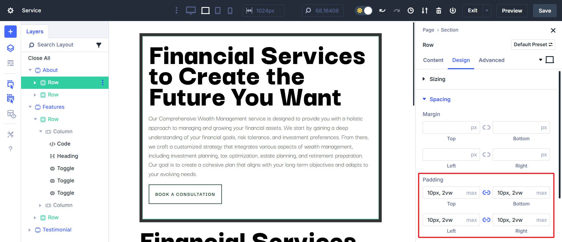
2. Row Padding And Border Width
Below, I have a design that warrants more inner padding and a larger border width as screen sizes get larger. To accommodate this, I’ve used the max() function to set right/left/top/bottom border width and padding on a Row. The CSS would be something like this:
 .container {
padding: max(10px, 2vw) max(10px, 2vw) max(10px, 2vw) max(10px, 2vw);
border-width: max(5px, 1vw) max(5px, 1vw) max(5px, 1vw) max(5px, 1vw);
}
This means that the max() function will choose whichever is bigger in whatever situation it is being applied to. The smallest padding on each side is 10px and the largest is 2vw. Similarly, for the border width, the smallest it ever will be is 5px, and the largest is 1vw).
Here is what max() in this situation looks like in Design >Spacing > Padding on the Row in Divi:
Here is what max() in this situation looks like in Design > Border > Border Width on the Row in Divi:

Together, I get the effect of having less padding on the inside of the row and a thinner border width on smaller screens. But it scales up as screen sizes get bigger and the vw value (remember, it’s a relative value) becomes bigger than the fixed pixel value.
This helps maximize the availability of smaller screens, while wider screens can fill the space more.
3. Full Height Hero Sections
Using the min() value on a section’s height, you can create a hero section that is at least a certain height but otherwise fits 90% of the full-screen height (and no more) using a simple min() function.
height: min(800px, 90vh)
This has the effect of having a full-height hero section except on larger (taller) screens, which would then show the next section below it. In Divi Sizing settings, this can be done with two different field inputs (width and max-width), but using the min() function, we can get the same effect using only one field in the sizing.

It keeps the hero section as the main thing for most screen sizes but doesn’t become too big in the few instances with taller screen resolutions.
4. Font Sizing
Using min or max for font sizes can help you achieve more dynamic sizing than static pixel values. For this, you’d want to use max() to scale up the font size based on screen size conditions. Set the pixel/rem value to the small absolute size you want to use and use a relative value to scale upward.
1rem equals the root font size (typically 16px unless customized in your site styles); a font size of max(1rem, 2vw) would take the larger of the two values and would never be smaller than 16px.
As you can see, on the smallest devices, the font size is set to 1rem/16px. At a certain point, the larger value becomes 2vw and scales the font size upward, making the font larger as screen sizes get bigger.
For font sizing, I don’t recommend using min or max but instead clamp(). Min/max only gives you dynamic scaling in only one direction, and to get close to the effect of clamp(), you’d need to set your min/max font sizing rules at multiple breakpoints (which is possible but far easier to simply use clamp).
Difference Between min()/max() And clamp()
You can understand clamp() as a combination of min() and max() with a preferred value in between. Clamp() takes one value for the minimum cap, one value as the maximum cap, and a third value (in the middle) as the preferred value that determines the slope of change between your min and max.
An example:
font-size: clamp(16px, 4vw, 40px);
This means the font size you are setting will never be smaller than 16px or larger than 40px. However, the rate it changes (based on screen size) is determined by the preferred value in the center.
Read my dedicated article on using clamp() to see my preferred Fluid Typography generator that creates your clamp() functions for you.
Try min() And max() With Divi 5
Min() and max() might not get as much attention as clamp() or calc(), but they’re essential tools for smarter, simpler, and cleaner responsive designs in Divi 5.
These CSS functions give you unique ways to control your website’s responsiveness. Once you understand when to use min() and max(), you’ll wonder how you managed responsive design without them. They’re fully supported across modern browsers, and Divi makes implementing them straightforward. Divi 5 is ready to be used on new websites.